Rebranding Plaid
In 2025, we changed everything but the logo. And we did it all internally.
-
While Plaid’s brand remained consistent, the market hadn’t. The fintech boom brought a new wave of customers into the digital finance world—many of whom were looking for simplicity, ease, and security in a constantly changing industry.
-
With a suite of new products, an expanding network of data, and an engaged industry of new audiences, Plaid had the opportunity to position itself as the leader of this change—a trustworthy guide in this brave new world.
-
Positioning Plaid as the fabric of finance—an expansive network as fluid as it is strong, constantly reinventing the way money looks and feels in the digital age.
-
Creative Director, Project Lead
-
Amy Wong (Art Direction), Toni Cincotta (Motion Design), Ryan Smith (Design Systems), Greg Makrigiorgos (Copywriting), Christophe Tauziet & Heather Mounsey (Leadership & Strategy)
THE PROBLEM:
A FINTECH BONANZA
When I started as a designer at Plaid in 2019, we were a very different company. We had just revolutionized account linking and powered a new wave of digital finance across the industry. This generation of fintech was still relatively new at the time, and as a result, our primary products and brand were targeted toward our developer audience—the implementers, builders, and tinkerers that were busy constructing the scaffolding of fintech today.

Plaid’s old homepage (2019)
Our original brand was sparse, minimal, and incomplete. It reflected the in-progress nature of our industry. Black linework with spots of color, technical type, and flat design not only invited our developer audience to build with us, to complete the picture, but also scale with us.
Everything in our design system, from black and white buttons to geometric vector art, was meant to be scaled quickly, efficiently, and with little to no lag. This worked well as fintech exploded under our touch in the pandemic, allowing Plaid to proliferate quickly with airy, easy-to-leverage assets. It’s no wonder we were lovingly referred to, by everyone in the industry, as the fabric of finance.
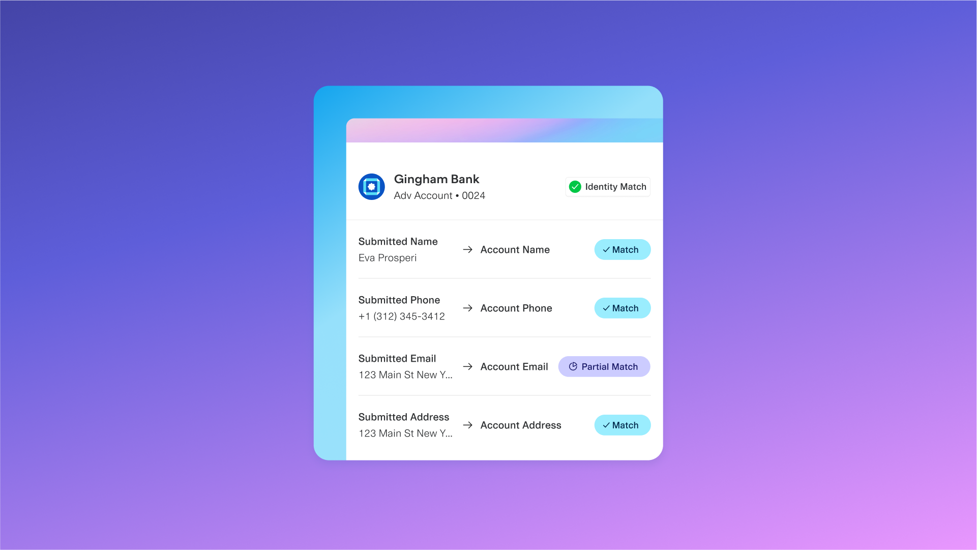
Over the years, as our industry evolved, so did our audience. We built a new suite of products centered around security, identity, and credit. It was clear that in the modern world, digital finance had the power to unlock opportunity for everyone, but someone needed to build the keys to make that possible. So we did. Through banking, linking, underwriting, investing, and a suite of other offerings, Plaid’s key ring promised to give everyone access to a financial system that traditionally only served itself. Finally, we were only a tap, swipe, or click away from the future of finance.

To say that this growth distorted our brand would be an understatement. Suddenly, we were no longer selling products just to digital-savvy developers—we were partnering with major financial institutions, banks, product leaders at enterprise tech companies, lawmakers on Capitol Hill, and of course, the end consumer at the other end of a screen. As these audiences blurred together, it was clear our brand needed to change. I was fortunate enough to be the Creative Lead tasked with making this happen.


Today, every company is a fintech company. It’s not just developers powering this technological revolution either. Financial institutions, policymakers, and even us—we, the people!—are defining how digital finance is built for the 21st century.


THE SOLUTION:
MAKE MONEY MATTER
Over the course of a year, our internal team built a new brand all from scratch, all in-house, to meet the growing demand of complex network that powered a suite of new, innovative products. I partnered closely with our C-Suite executives, including our CEO Zach and CPO Jen Taylor, as well a tiger team that included our Head of Comms, Head of Design, and Head of Creative, to craft a new brand system that reflected who we are and what we stand for.
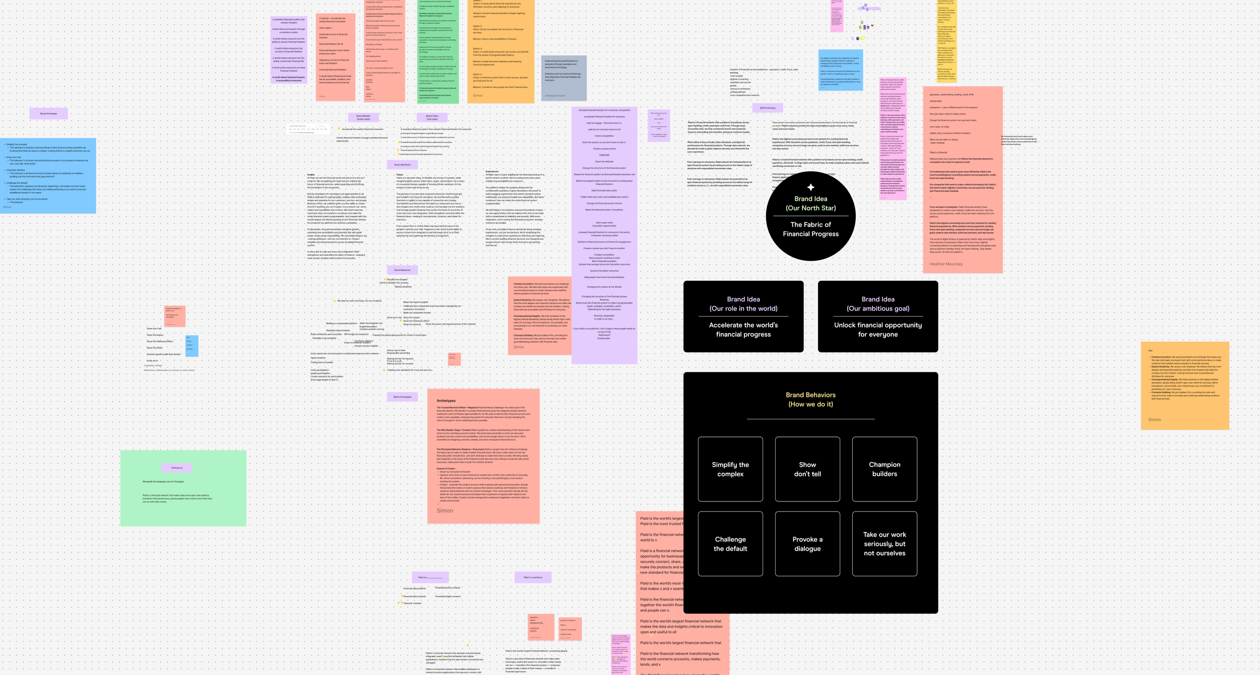
It took many long hours aligning with leaders across the company to land on a brand strategy framework that made sense for Plaid. To crystallize our mission, we landed on a simple brand role that would anchor our system in visual metaphor. Plaid is the fabric of financial progress. By adopting the title that had been given to us by our industry, we were now taking it a step further. Today, Plaid is no longer the platform—the fabric—holding fintech together. We’re the network powering a new era of progress.
At Plaid, we're all about progress. Moving money forward. Building an equitable, safe system that works for everyone...and not against them. Imagine that.

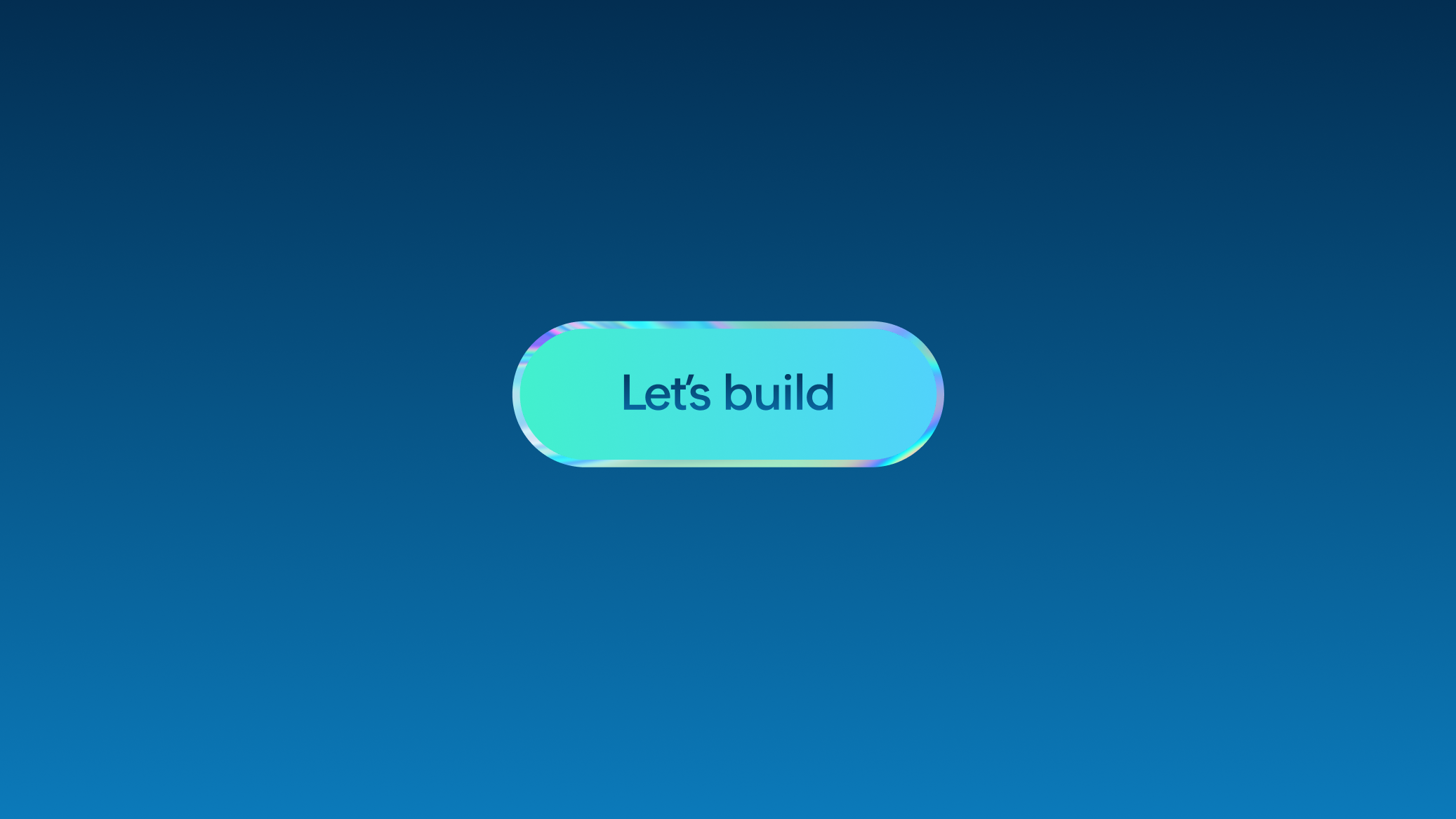
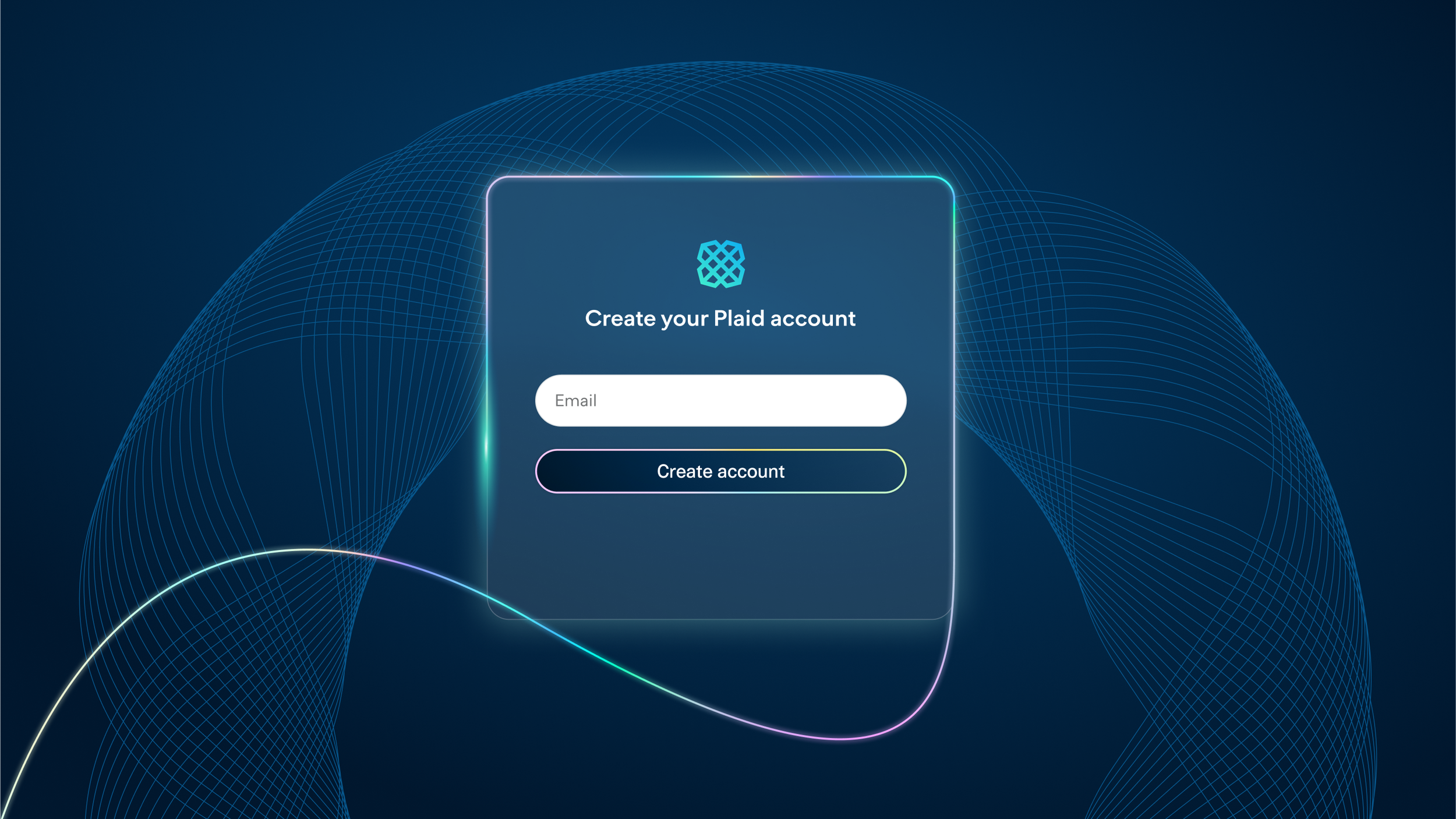
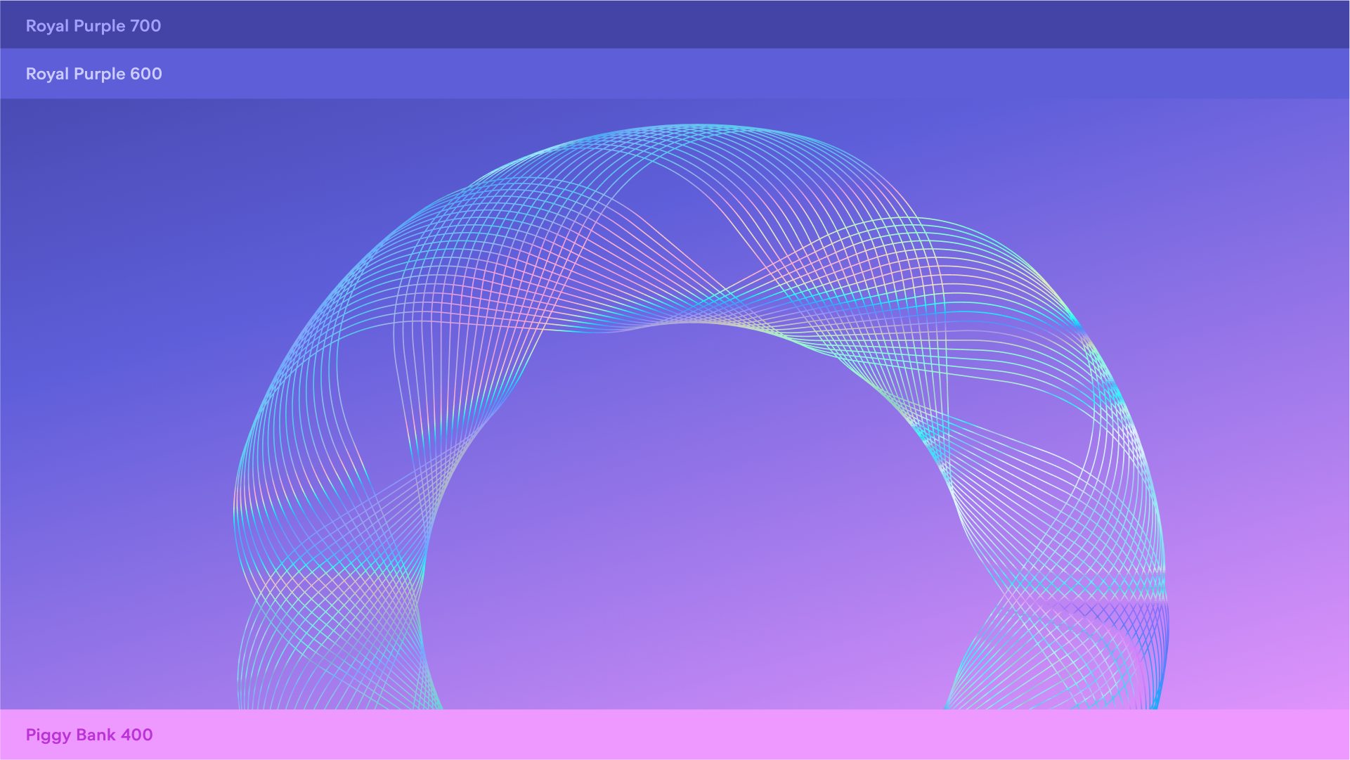
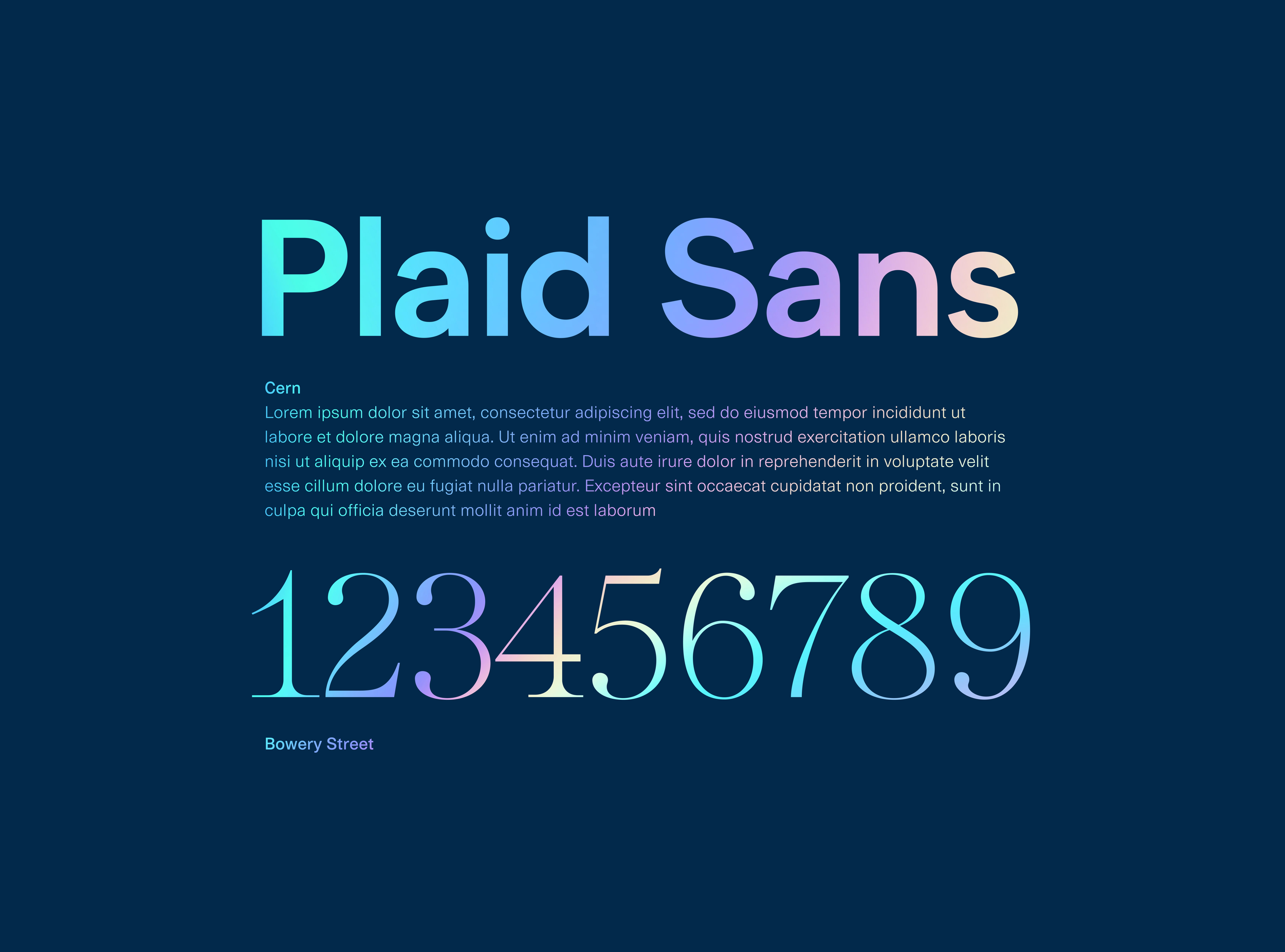
“Money reinvented” became our new creative concept, the driving force linking the “why” and the “how” of our brand. Plaid was literally reinventing how money looks and feels in the modern era, while building on the great legacy of our financial history. What if we could tell that story with our colors, type, illustration, pattern, photography, and design system? Thus, the new brand was born: a look and feel inspired by the art, beauty, and design of paper currency from around the world.

In the end, we changed everything about our brand except for the logo, our most recognizable and equitable asset. For years, the Plaid symbol has stood at the center of tremendous change in fintech, and based on user research, it was clear that relinquishing this asset would only dilute our brand, rather than strengthen it.
In the past, we relied on the wordmark to equate our name to the symbol, but as we developed brand guidelines, we allowed our company to ditch the wordmark if needed, placing even greater equity in the symbol itself.
THE RESULTS
We are actively measuring our new brand today, using a brand sentiment tracker. Our primary goal is to understand if our customers and end users have a better understanding of who we are and what we can offer them. Previous studies have demonstrated the strength of our brand and the trust that it evokes within our industry—but that trust is closely linked to perception and memory. When customers and consumers remember us, they trust us. We are no longer a brand that sits behind the scenes. The question remains…will that pay off?
Over the next year, we are constantly testing and iterating on the brand, improving it based on data from our brand sentiment tracker and quantitative conversion studies across all channels. We’ve already seen amazing results, but will need to keep reinventing ourselves if we want to keep up with so much innovation. The brand building is just getting started. Stay tuned for me…


Challenges
I learned a lot from the experience of rebranding Plaid and overhauling its design system from the ground up. A few lessons below…
Lesson 1: The agency model only works when we strip away barriers.
In this day and age, especially in tech, many founder CEOs want to work closely with brand design to reinvent themselves. They are not looking for a one-stop shop to quickly spin up new directions. The agency model today isn’t built for tight-nit collaboration between dedicated C-Suite founders—it’s costly, energy-taxing, and requires trust to be built more quickly than the work allows. This is especially true for companies selling complex, technical products driven by a compounding network effect. We worked with a well-known branding agency at the start of this project, but parted ways when our CEO felt distant from the process of design iteration, coming to meetings looking at solutions rather than creative dialogue. Only when we placed our internal team at the center of our working model—before partnering with ad hoc vendors and partners rather than one-stop-shops—did the creative barriers come down and solutions flourish.


Lesson 2: Diverse, internal teams benefit from focused sprints.
One technique I do think is effective is creative sprints. After stepping away from our agency relationship, our team was left with no budget and an urgent need to deliver a brand system quickly, or not at all. Instead of preparing a brief for a few brand designers, or asking the entire team to iterate, I met instead with small pods of 2-3 writers and designers and presented the brand problem with our new strategy. In these small settings, I allowed mini groups to pitch ideas and iterate in real time, asking questions and reacting to the strategy. Then, they were given a page in Figma to privately ideate. This allowed less extroverted designers to offer their ideas and questions in the format most comfortable to them—visual, verbal, or on the page.
Once each team had a place to “play,” I encouraged them to ideate over the course of a week. After a week, we came together, shared ideas, and I was able to pull techniques ad hoc from every group, mixing them up and creating new pairs to build off existing ideas. Some teams had amazing ideas for illustration, others photography, some type systems and web layouts. The thing holding them together? A single brand strategy mixed with dedicated, focused risk. Culling these concepts together formed the scaffolding of a new system, which I took to our C-Suite to positive response. In two weeks, we had a brand system ready to expand and tinker.

Lesson 3: For more creative voices, tap into a global network.
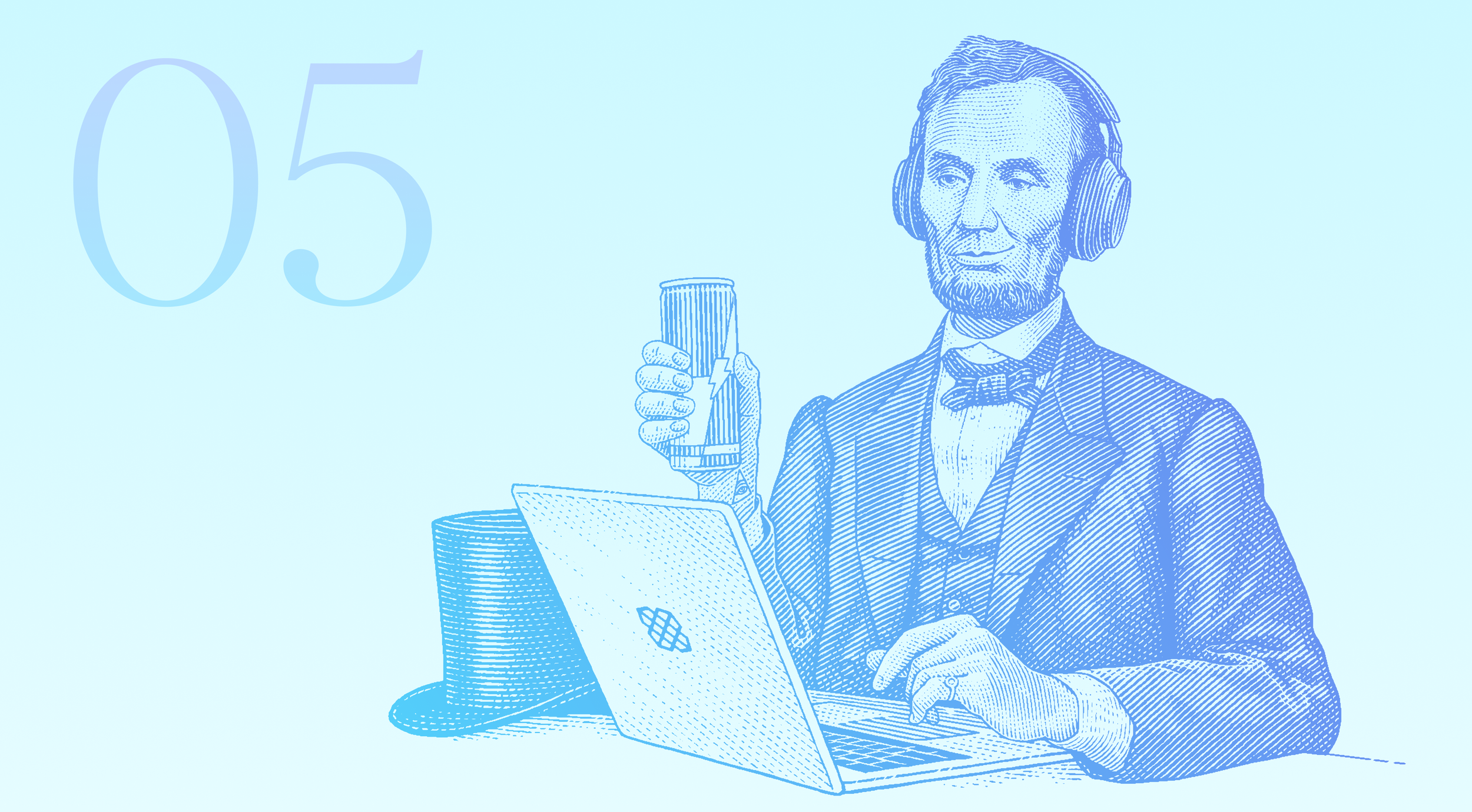
This project taught me that there are massive changes happening in the way we find inspiration in this remote first, AI curious world, one that is fundamentally changing the way creative teams collaborate and build. When we parted ways with the traditional agency model and took our work all in house, we gave ourselves permission to hand select artists from around the world to help us build our brand, sourcing them based on their work rather than where they live or what relationships they have with the industry.
Our fonts were made by a typographer in Tokyo. Our illustrations by an artist in Turkey. Our photography by an all female team in Brazil. We even used AI to pitch our vision in a clear, easy to understand way that transcended language barriers and time zones. We never would have been able to do this if it weren’t for some new tools. I think we made the entire brand system using one single Figma file, from brand strategy to implementation. Which meant we weren’t just building a brand system, but also a fully integrated and accessible design system. And, because we were using artists from different regions around the world, we were able to leverage higher quality work for a fraction of the price, while paying artists directly for their services.